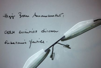
 |
| Dignified and to the point, I think |
Cooking recipes in fonts that
look like handwriting are perceived as more demanding and because it takes longer
to read them, they’re more difficult to follow and the food will be more
difficult to prepare. I find myself wondering how
much of the backlash against Comic Sans is due to the font's name rather than
its appearance. Looked at dispassionately, the font is not really
"funny" – it seems to me to have no comedic currency at all. It is,
on the other hand, highly legible, especially when used in low resolution. This
was probably why it was chosen, sensibly, to label presentation slides. Also, using it gives one a distinct kindergarten tingle as if one's teacher is about to award a gold star in one's writing book with a suitably encouraging (handwritten) comment.
But, it has the word "comic" in its name. This clearly means that it is not suitable for serious, grown-up endeavours. Had the same font been named "Gravitas Sans", the reaction might have been more favourable, but it wouldn't've made such a delightful anagram for the title. I hope the CERN presenters are taking notes.
But, it has the word "comic" in its name. This clearly means that it is not suitable for serious, grown-up endeavours. Had the same font been named "Gravitas Sans", the reaction might have been more favourable, but it wouldn't've made such a delightful anagram for the title. I hope the CERN presenters are taking notes.

"John can barely contain himself."
ReplyDeleteHa.
Having seen John when he truly cannot contain himself,and knowing this happened because he was surprised by HandyMan's sly wit, I am quite certain that a mere font (of any shape or size) did not produce the same reaction.
Hence, I can only assume the stuff dripping down the screen of my new MacBook is sarcasm.
Pass me a tissue.
In waterfalls. You'll need more than a tissue. Not being written in Comic Sans clearly lends gravitas to 'sly wit' How deceitful.
DeleteIn waterfalls. You'll need more than a tissue. Not being written in Comic Sans clearly lends gravitas to 'sly wit' How deceitful.
Delete